Duration:

3 Months

Role:

UX/UI Designer

This UX case study focuses on the ongoing development of the Relevance e-commerce homepage, a project I’ve been working on for the past three months.


The goal was to create a visually engaging, user-friendly platform that highlights deals, featured products, and brand offers. The project is still evolving, with continuous improvements based on user feedback and performance testing.

Introduction

Overview:

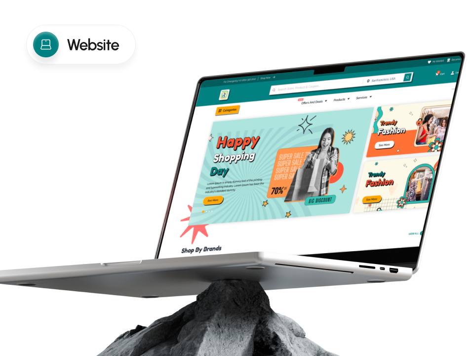
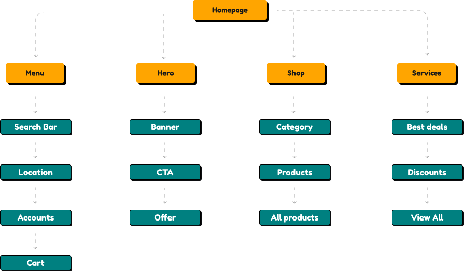
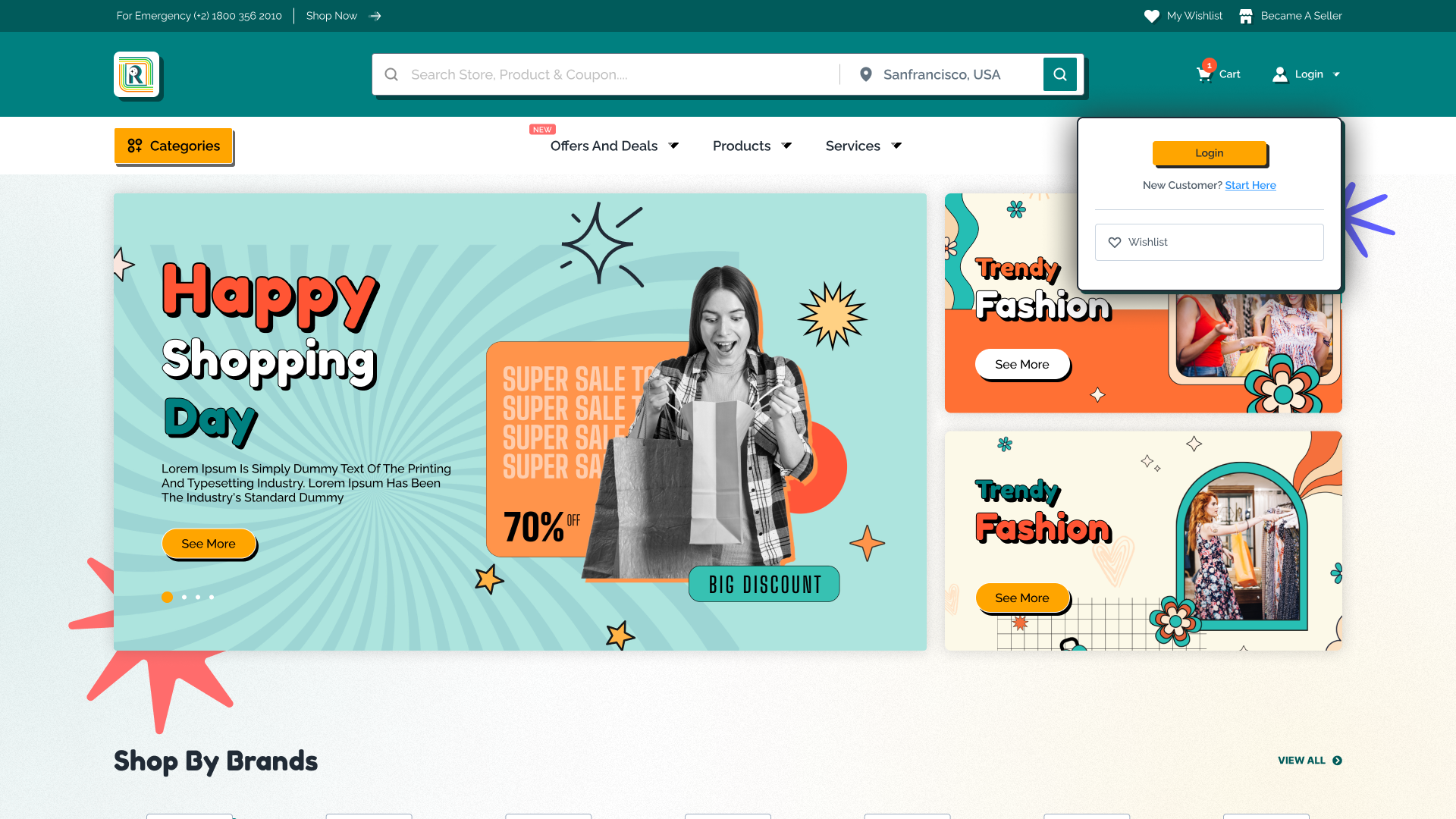
Relevance is an e-commerce platform designed to showcase curated deals, trending services, and brand offers through a visually engaging and user-friendly homepage.

Project background:

With online shopping experiences often cluttered and overwhelming, I spent three months leading the UX design to build a modular, conversion-focused layout that balances aesthetics with usability. The project is still in active development.

What I will cover:

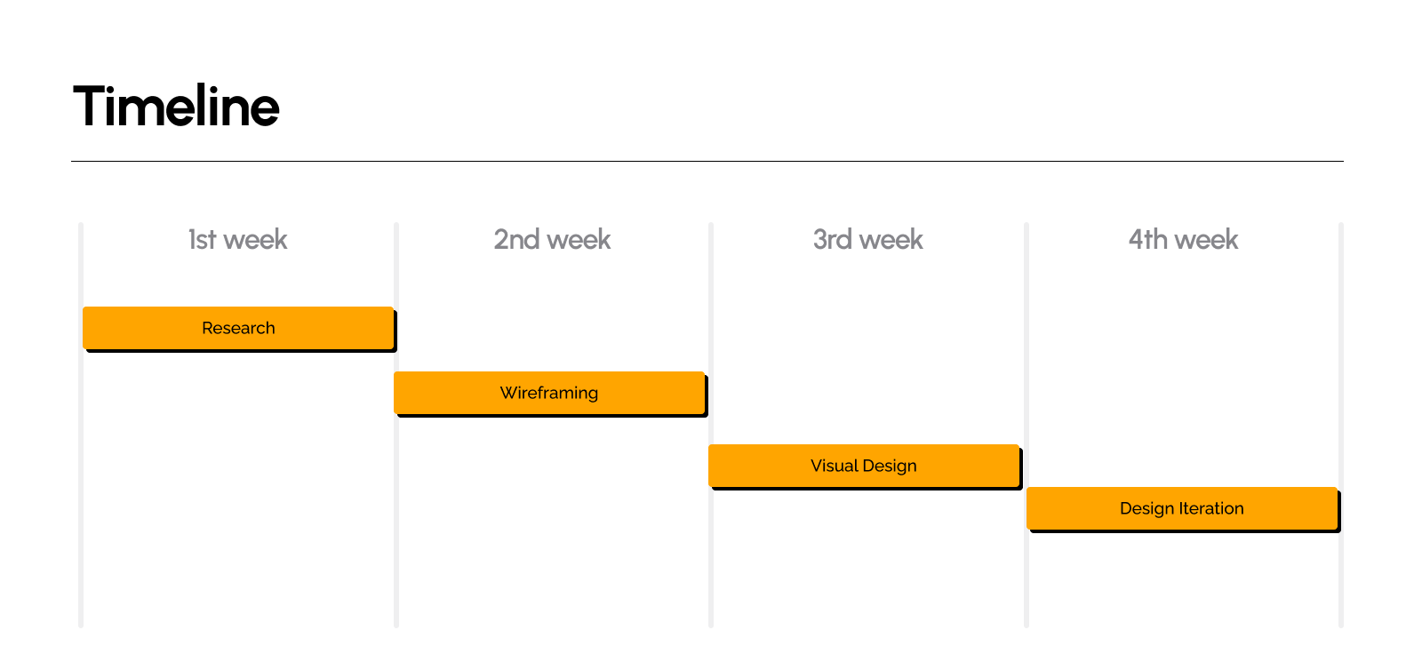
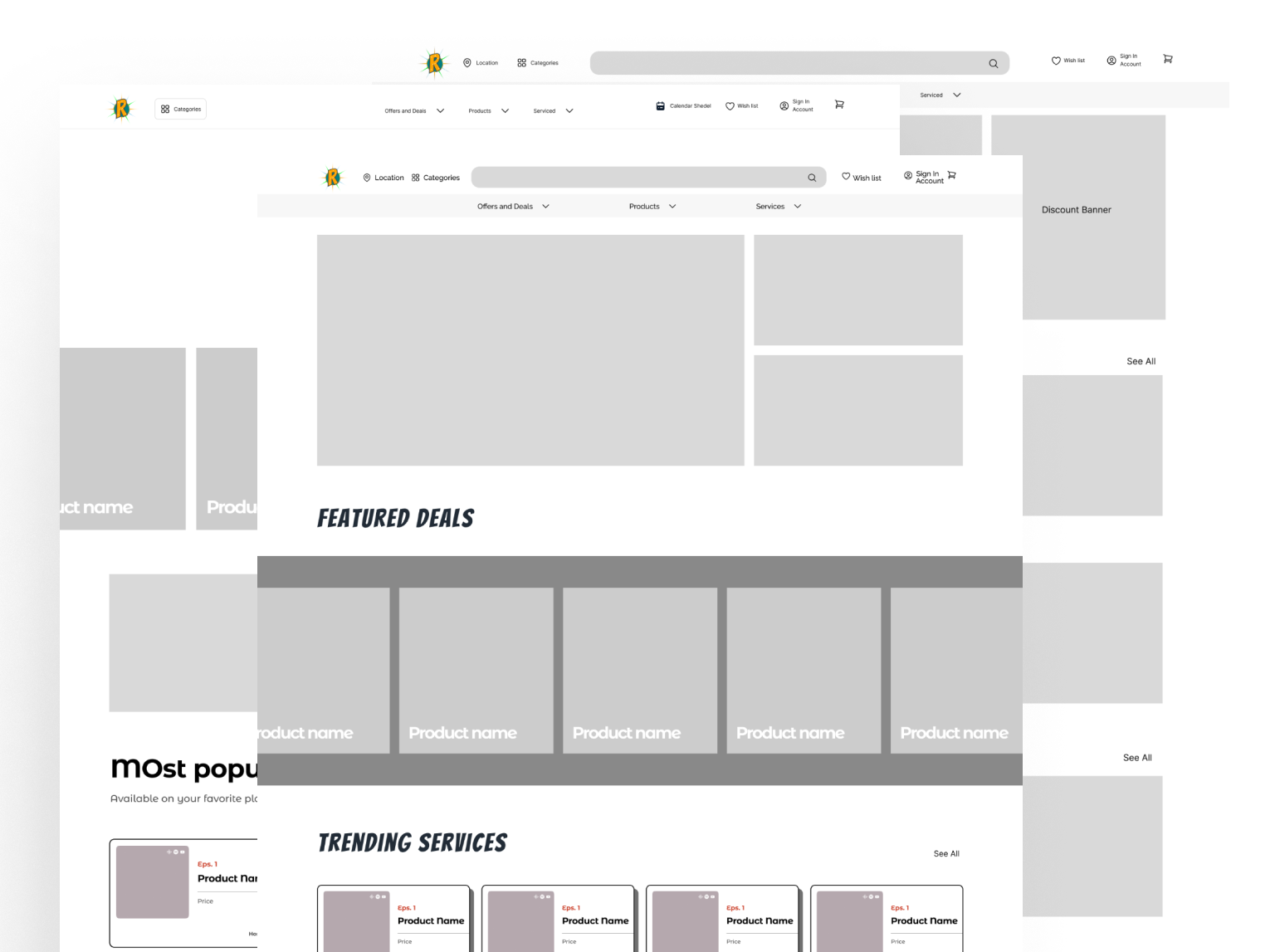
This case study outlines the full design process—from research and wireframing to prototyping and testing—highlighting key decisions, UX challenges, and opportunities for future enhancements.

My Roles & Reponsibilities

UX Research and analysis

Wireframing & Prototyping

Visual Design (UI)

Testing & Iterating

Design Process

Design Process

Concept design

User testing

Design Iteration

Visual Design

Problems

Users often feel overwhelmed by too many deal tags, colors, and competing visual elements, making it hard to focus on a specific offer.

This reduces clarity, increases bounce rates, and hurts overall engagement.

All users are shown the same deals and products, with limited personalized recommendations based on browsing or purchase behavior.

It creates a generic experience, reducing the likelihood of conversion or return visits.

Generic placeholders like “Product Name” and repeated brand tags (“Cocktail”) confuse users and reduce trust in the platform’s authenticity.

This can make the platform feel unpolished or unreliable, especially for first-time visitors.

While there are several CTAs like “See More” or “Get Code,” users aren’t always clear where they’ll be taken or what the next step is.

Unclear navigation disrupts the shopping flow and may cause drop-offs before conversion.

In the “Shop by Brands” section, all brand labels look the same, and the actual brand experience is not highlighted.

Users can’t easily find their favorite brands or discover new ones effectively, limiting exploration.

Project Objectives

Design a homepage layout that allows users to browse deals, brands, and services effortlessly with clear visual hierarchy and intuitive flow.

Create compelling deal sections and CTAs that encourage users to explore, click, and complete purchases or actions.

Incorporate smart recommendations and dynamic content to tailor the shopping experience based on user preferences and behavior.

Build a modular and adaptable design system that can support diverse content types, seasonal campaigns, and future platform expansions.

Success Matrics

KPI 1

Conversion Rate

Why it matters :

Why it matters : Measures how effectively the homepage drives users to complete key actions like clicking deals, signing up, or making a purchase.

What it tells us :

What it tells us : If the layout, CTAs, and deal presentation are motivating users to act.

Insight :

Insight : A higher conversion rate indicates strong visual hierarchy, trust, and clear user flows.

KPI 2

Bounce Rate

Why it matters :

Shows how many users leave the site without interacting, highlighting friction or lack of relevance.

What it tells us :

If users are finding the initial experience engaging enough to continue browsing.

Insight :

A lower bounce rate reflects better first impressions, faster load times, and intuitive content structure.

KPI 3

Average Session Duration

Why it matters :

Indicates how long users are staying on the site, which helps gauge engagement.

What it tells us :

If the content and browsing experience are holding users’ attention.

Insight :

Insight : Longer session durations often mean users are exploring multiple sections and finding value.

Research goals & methods

Understand user needs:

Our goal was to understand how users navigate and interact with e-commerce homepages—what influences their purchase decisions, how they explore deals, and how visual hierarchy and content relevance affect their journey.

Identify pain points:

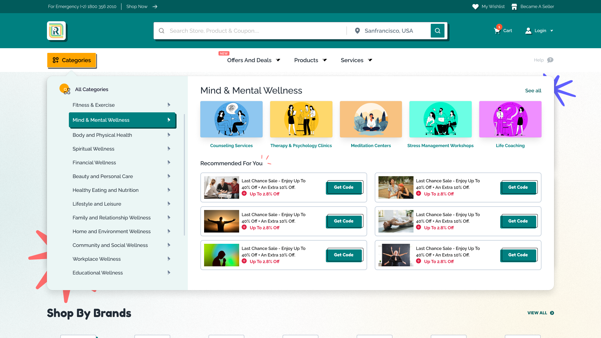
Through user research, we discovered that users often feel overwhelmed by cluttered layouts and inconsistent deal placements. Many struggled with finding specific brand offers or trending items quickly. Additionally, users highlighted the need for more personalization and clearer categorization of deals.

Explain research methods:

To uncover meaningful insights, we used a mix of qualitative and quantitative research. We conducted user interviews to understand motivations, frustrations, and browsing patterns. Online surveys helped capture broader preferences around homepage layout and deal engagement. We also ran competitor analysis to identify UX benchmarks and gaps in current e-commerce experiences.

User Needs

Quick access to relevant and trending deals without information overload

Personalized product and service recommendations based on interests or past behavior

Clear categorization of brands and offers to reduce decision fatigue

A visually clean, easy-to-navigate layout that guides them through the shopping journey

Trustworthy and up-to-date content (accurate prices, availability, and discounts)

Fast-loading interface, especially for mobile users

Simple filtering and sorting options to refine search results efficiently

Clear and compelling call-to-actions (e.g., “Get Code”, “See More”) for easy next steps

User Persona

Saif Rahman

Saif Rahman is a 38-year-old senior operations manager at a telecom company in Dhaka. He oversees multiple teams responsible for network deployment, support services, and contract execution. Saif is detail-oriented and works under high pressure to deliver timely updates and project progress to upper management.

He often finds it difficult to keep track of everything due to using multiple tools—Excel sheets, emails, and third-party apps—which slows down coordination. Searching for project status, assigning tasks, and handling support tickets takes up a lot of his time.

The PRMS dashboard helps Saif centralize his workflow. With clear modules for project tracking, real-time data visualization, contract management, and travel logs, he can make decisions faster and manage his team more efficiently. The role-based view ensures he sees only what matters most to him, reducing noise and improving productivity.

Goals/Needs:

  • Discover relevant, high-value deals without wasting time.
  • Browse trending products and services in a clean, organized interface.

Pain Points:

  • Overwhelmed by too many categories and unclear deal hierarchies.
  • Distrusts platforms that show repetitive or irrelevant promotions.

Frustration:

  • Spends too much time comparing deals across different platforms.
  • Finds many e-commerce sites visually cluttered and hard to use on mobile.

Motivation:

  • Wants a fast, frictionless browsing experience with curated offers.
  • Values platforms that save time and provide smart recommendations.

Information Architecture

Wireframe

Visuals

Conclusions & Final Thoughts

Designing the Relevance homepage was a deep dive into solving real user frustrations around deal discovery, visual overload, and content personalization. Over the course of three months, this project evolved through iterative research, prototyping, and testing—resulting in a modular, scalable homepage built to drive engagement and conversions.


By focusing on clean layout structure, user-centric content blocks, and intuitive navigation, we aimed to create a platform that feels both exciting and effortless to explore. While the project is still in development, early insights show promise in how users interact with the curated experience. As we continue refining and scaling the design, our priority remains the same: making online shopping smarter, faster, and more satisfying.