

I’m currently contracted to design a comprehensive dashboard for PRMS, a global telecom solutions provider that works with major brands like Telenor, Airtel, Peek, and Becom. The platform is being built to streamline internal operations for telecom companies—covering project management, analytics, support, and contract services.
The design process is still ongoing, with a strong focus on user roles, real-time data access, and a scalable interface that caters to both technical teams and executives.
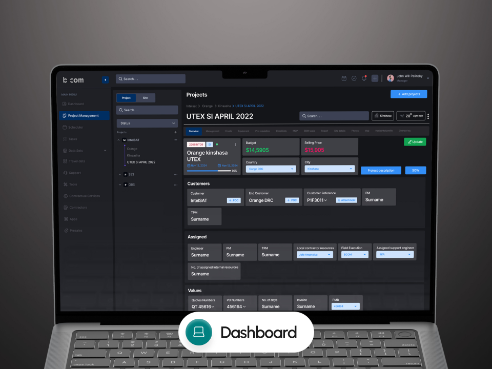
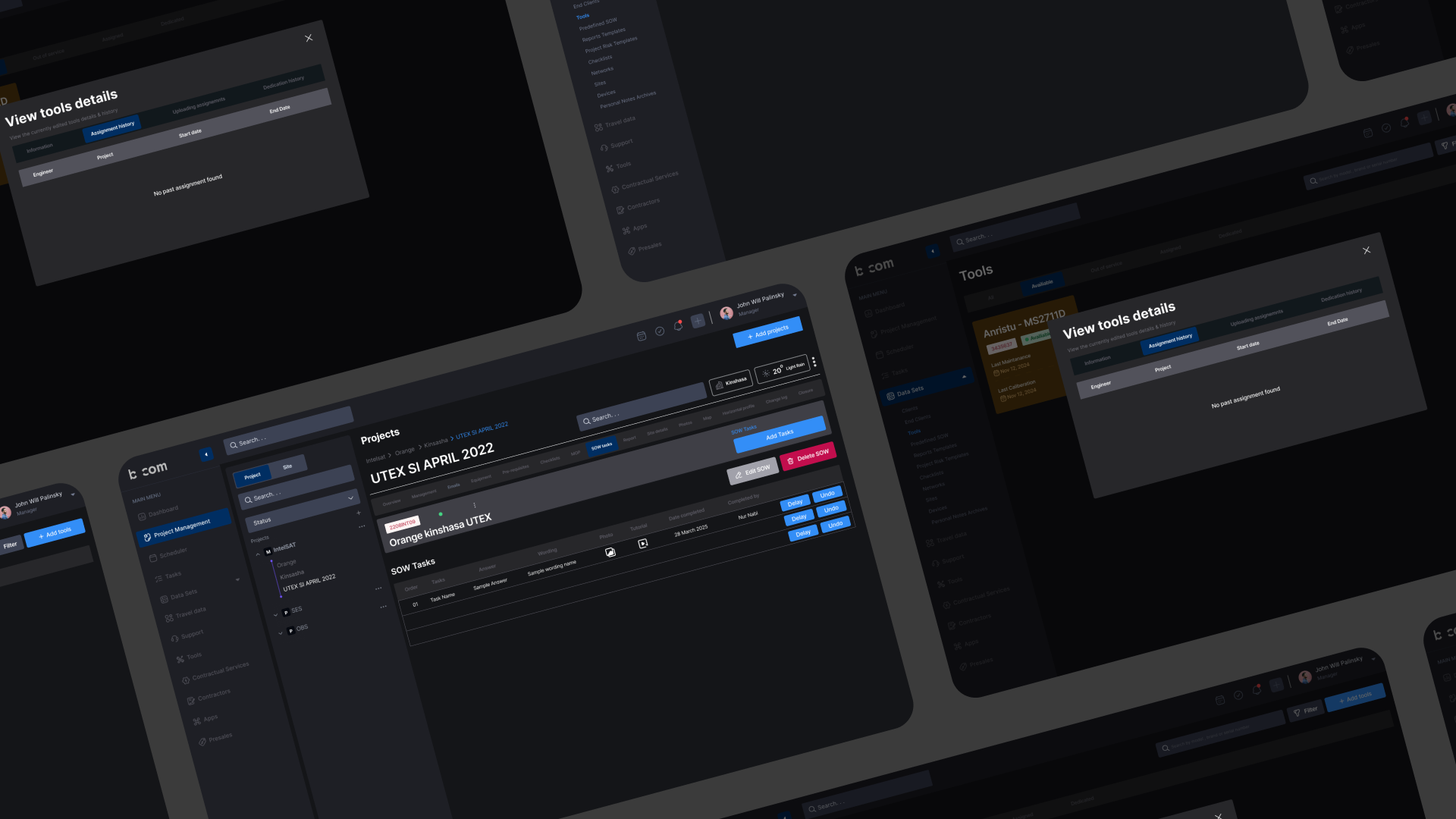
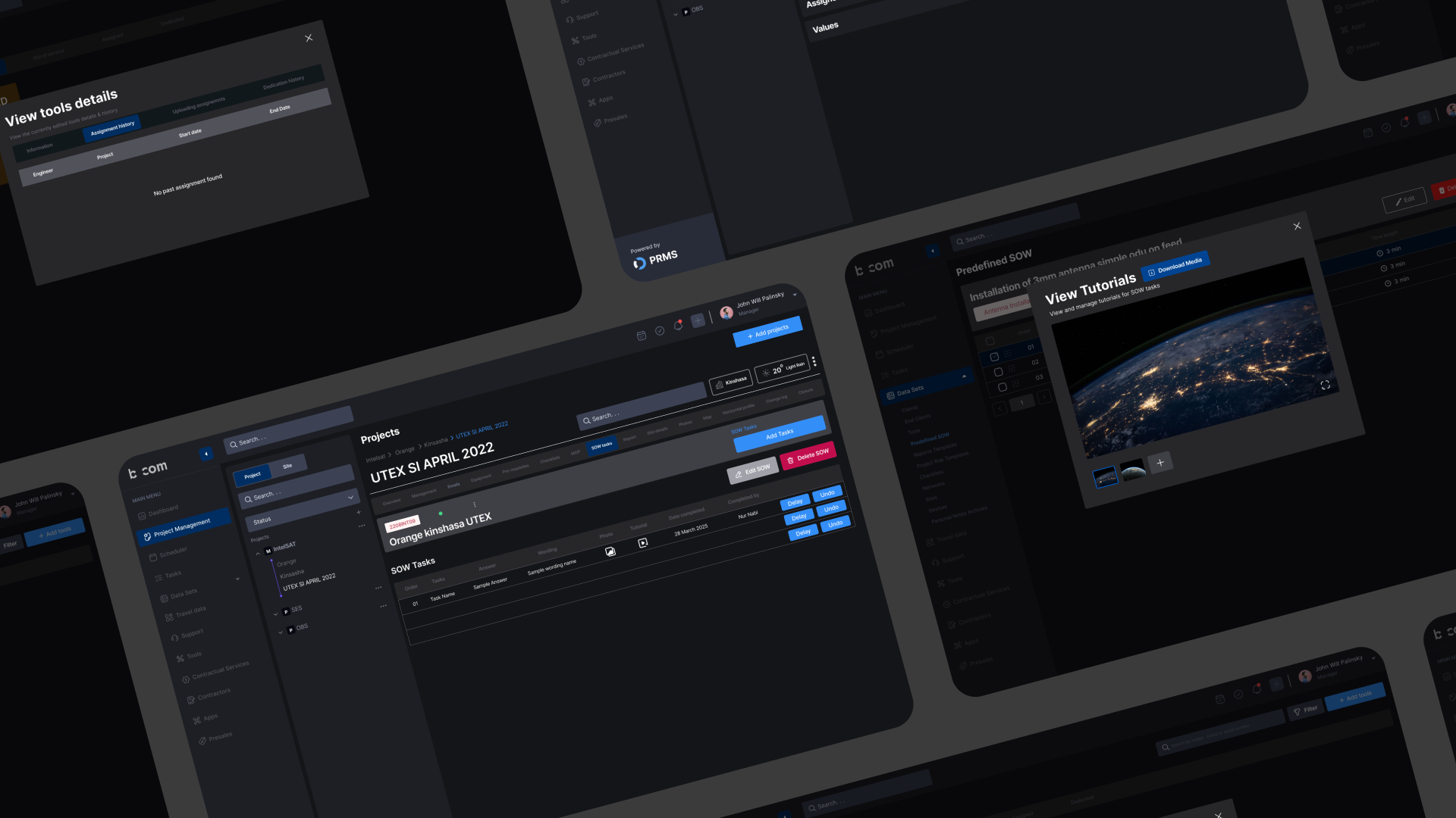
PRMS is a telecom operations dashboard designed to support global brands like Telenor, Airtel, Peek, and Becom. It helps teams manage projects, monitor data, and streamline internal workflows through a scalable and user-friendly interface.
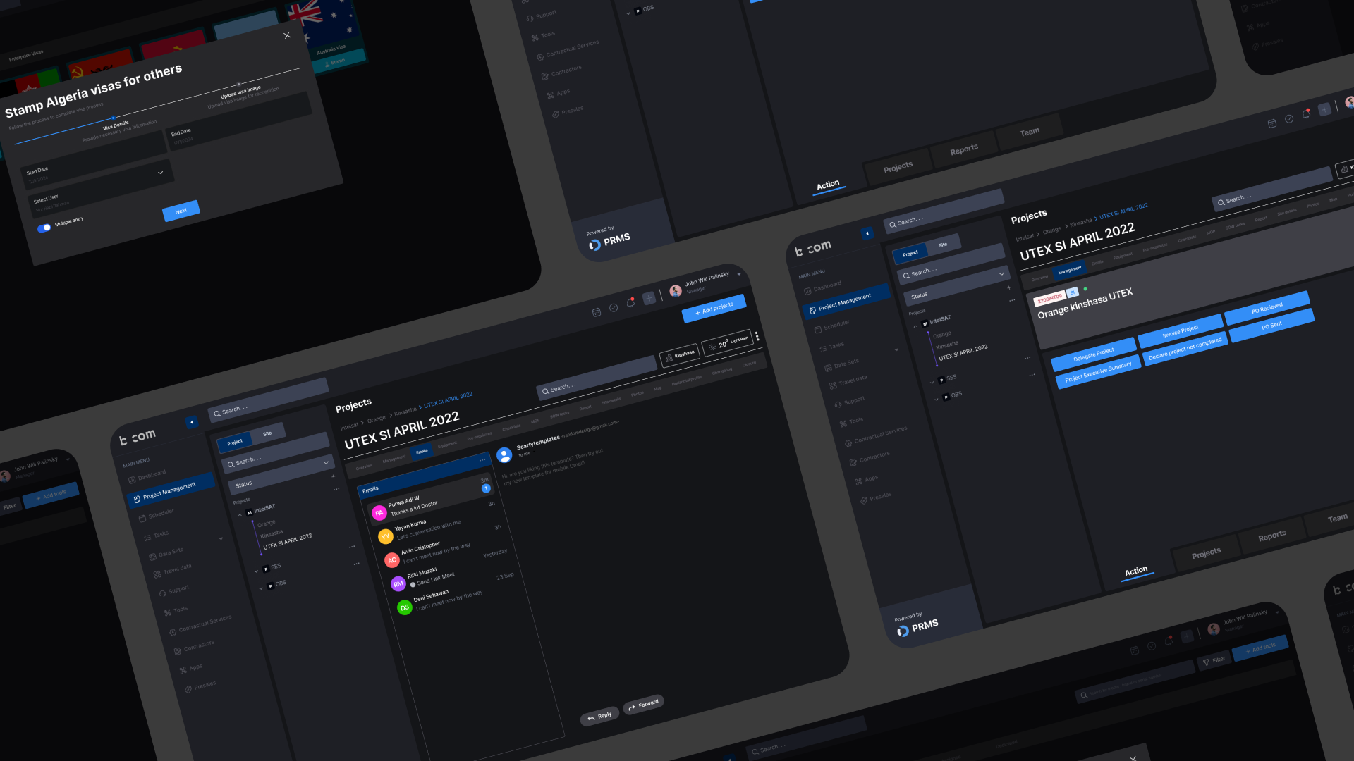
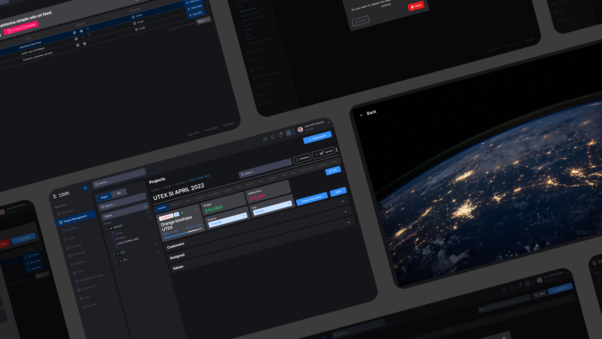
With enterprise dashboards often being complex and hard to navigate, I was contracted to design a clean, role-based platform that brings clarity to operations. The dashboard includes modules like project management, analytics, support, and contract services. The project is currently in active design and development.
This case study outlines the UX design journey—from research and role analysis to wireframing and interactive prototyping—highlighting key decisions, design challenges, and opportunities for future optimization.
Our goal was to understand how telecom teams interact with internal dashboards—what information they prioritize, how they manage tasks, monitor performance, and collaborate across roles. We focused on identifying gaps in usability, data visibility, and workflow consistency.
Through user research, we discovered that users often face difficulties due to overwhelming interfaces, unclear task flows, and lack of personalized views. Many teams struggled to access key data like contract statuses, travel logs, or project updates without jumping across sections. Users also expressed the need for real-time visibility and more contextual data presentation.
To gather meaningful insights, we used a mix of qualitative and contextual research. We conducted stakeholder interviews to understand departmental needs, task habits, and communication workflows. Additionally, we reviewed competitor dashboards in telecom and project management to identify UX patterns and performance gaps. These insights informed a design strategy focused on clarity, speed, and role-based efficiency.
Saif Rahman is a 38-year-old senior operations manager at a telecom company in Dhaka. He oversees multiple teams responsible for network deployment, support services, and contract execution. Saif is detail-oriented and works under high pressure to deliver timely updates and project progress to upper management.
He often finds it difficult to keep track of everything due to using multiple tools—Excel sheets, emails, and third-party apps—which slows down coordination. Searching for project status, assigning tasks, and handling support tickets takes up a lot of his time.
The PRMS dashboard helps Saif centralize his workflow. With clear modules for project tracking, real-time data visualization, contract management, and travel logs, he can make decisions faster and manage his team more efficiently. The role-based view ensures he sees only what matters most to him, reducing noise and improving productivity.
Designing the PRMS telecom dashboard has been an ongoing, collaborative process focused on streamlining complex workflows for large-scale telecom operations. By grounding our design in user research and industry insights, we aimed to create a solution that is not only functional but also intuitive for a wide range of users—from project managers to support teams.
While the dashboard is still in development, early prototypes and feedback indicate a strong alignment with user needs, particularly around role-based views, centralized task management, and data accessibility. As we continue to refine the interface and test usability, our goal remains to deliver a scalable platform that enhances efficiency, reduces friction, and empowers telecom teams to make faster, data-driven decisions.