
You’re doing checkout screens wrong
Duration:
2 Months
Role:
UX/UI Designer
Headlyne AI is an innovative mobile application designed to empower users in pursuing their goals through personalized insights and actionable strategies.
In just three months since its launch, Headlyne AI achieved an incredible milestone of 100,000 downloads and was honored with the “App of the Year” award on the Play Store.
Case Study
Designing a checkout experience
Multi-step checkout for StoreMe - Your Ultimate Destination for Shoe Shopping
PRMS is a telecom operations dashboard designed to support global brands like Telenor, Airtel, Peek, and Becom. It helps teams manage projects, monitor data, and streamline internal workflows through a scalable and user-friendly interface.

Intro
The checkout process typically imposes a heightened cognitive load compared to other stages within the customer journey. It necessitates the completion of forms, meticulous review of information, and ultimately, a final decision to proceed with a purchase. Neglecting the user experience and interface during checkout can exacerbate this situation. Insufficient attention to this aspect often results in potential customers abandoning their carts, leading to increased rates of cart and checkout abandonment. All these factors underscore the importance of meticulous design in crafting the checkout experience. Let us delve into a multi-step checkout process that could serve as a universal foundation for delivering an exceptional user experience.
The Importance of Exceptional UX Design in the Checkout Process
A seamless and user-friendly checkout process stands as a cornerstone for ensuring a positive customer experience and mitigating cart abandonment rates. In the realm of online retail, cart abandonment poses a common challenge, often stemming from various issues encountered during the checkout phase. Lengthy and convoluted forms can dissuade users from finalizing their purchase, leading to frustration and subsequent abandonment. Moreover, the absence of specific payment methods or a limited range of options may present hurdles, prompting potential customers to reassess their decision to proceed with the purchase.
Equally imperative is the provision of a guest checkout option, accommodating users who seek a swift and hassle-free process devoid of the necessity for account creation. A meticulously crafted UX design addresses these concerns adeptly, streamlining the checkout process, mitigating friction, and ultimately enhancing conversion rates by establishing a smoother trajectory from product selection to successful transaction completion.
Determining the Appropriate Use of a Multi-Step Checkout Process
While one-page checkout designs have garnered popularity for their efficacy in streamlining the purchase process, it remains imperative to discern the utility of a multi-step approach in specific eCommerce contexts. Particularly in online stores showcasing intricate and customizable products with an array of options, consolidating all selections onto a single page may overwhelm users. Moreover, a multi-step checkout facilitates a structured presentation of information, guiding users through each phase of the process with clarity. This method also fosters user engagement by breaking down complex tasks into manageable steps, thereby diminishing the likelihood of errors or confusion.
Furthermore, in scenarios necessitating the collection of supplementary information, such as shipping preferences or customization details, a multi-step checkout offers a structured framework for acquiring this data without inundating users with excessive information. Hence, a deliberate evaluation of the eCommerce landscape becomes imperative in determining the optimal checkout design, considering variables such as product intricacy, user experience, and the imperative for comprehensive data collection.
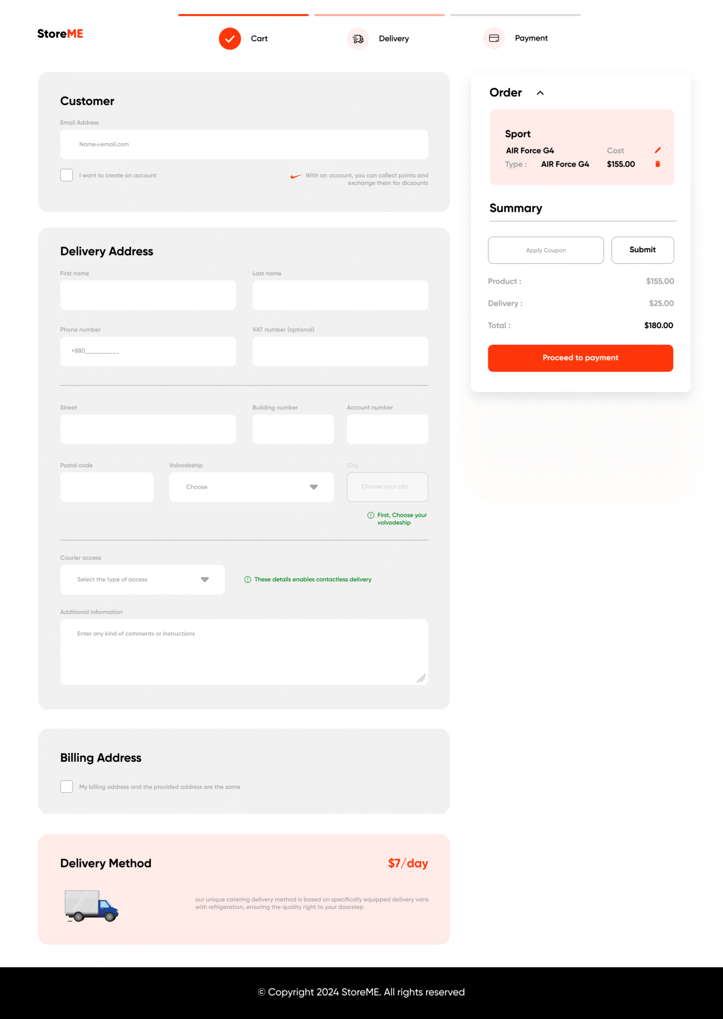
Designing multi-step checkout for Shoe purchasing website
1. Streamlined Navigation for Shoe Shopping
- Links to auxiliary site pages such as “About Us” and “Contact”
- Mini-cart and user account icons and links
- Wishlist and search functionalities integrated into the navigation

Simplified top navigation bar
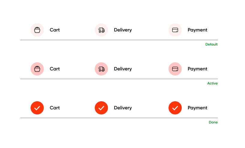
Informing about progression
- Cart
- Delivery
- Payment
Clean interface
To enhance the simplicity of the checkout process, we have implemented several measures to eliminate potentially extraneous and distracting elements:
1Simplified footer
We have retained only a minimal bottom bar housing ,a copyright notice in the footer. All other elements, including navigation and social media links, have been removed.
2Limited “Go back” options
To discourage users from deviating from the checkout process, we have minimized the availability of a “Go Back” link or button, apart from the home button. This strategic decision aims to prevent unnecessary exits. However, users retain the ability to navigate back to previous or completed steps through links incorporated in the summary section. This approach ensures a streamlined checkout experience.

Simplified footer
2Avoiding Unnecessary links & banners
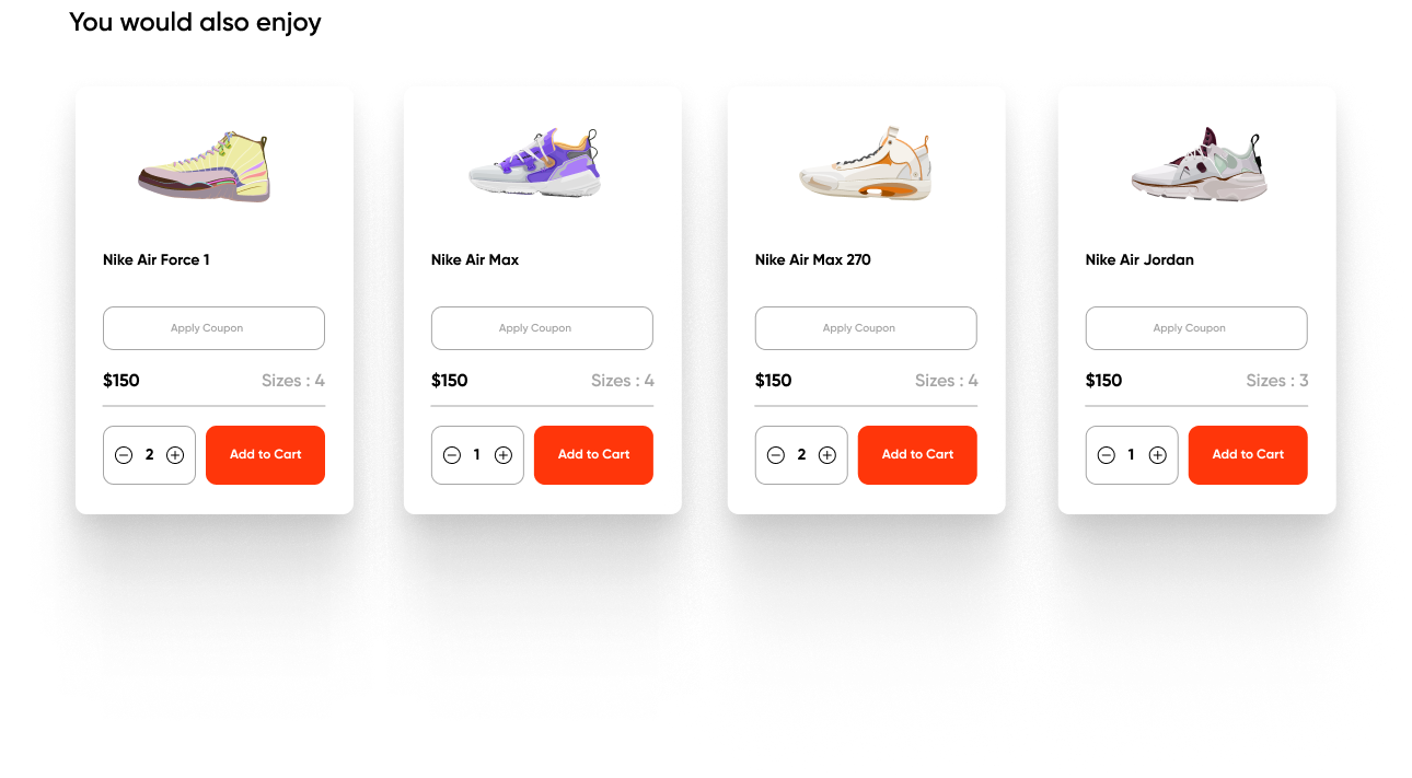
The inclusion of promotional banners and product ads during the checkout process can divert users from completing their purchase. Hence, we have refrained from displaying such elements throughout the process. An exception is made for an “You would also enjoy” section at the bottom of the Cart step, allowing users to seamlessly add a featured product to their cart instantly. Notably, this section is excluded in subsequent steps to maintain focus.
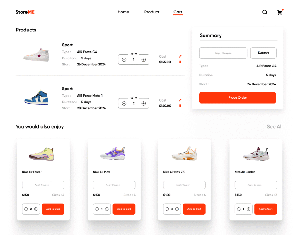
2. Cart Review
Product list
At this step, it’s crucial to offer a visual recapitulation of all selected products. In the context of StoreME, where a majority of products come with various configurations (users choose different variants, service duration in days, and a delivery start date),
incorporating an edit feature becomes essential. This feature empowers users to effortlessly reconfigure their chosen products. The users can also remove products from the list or change their quantity.
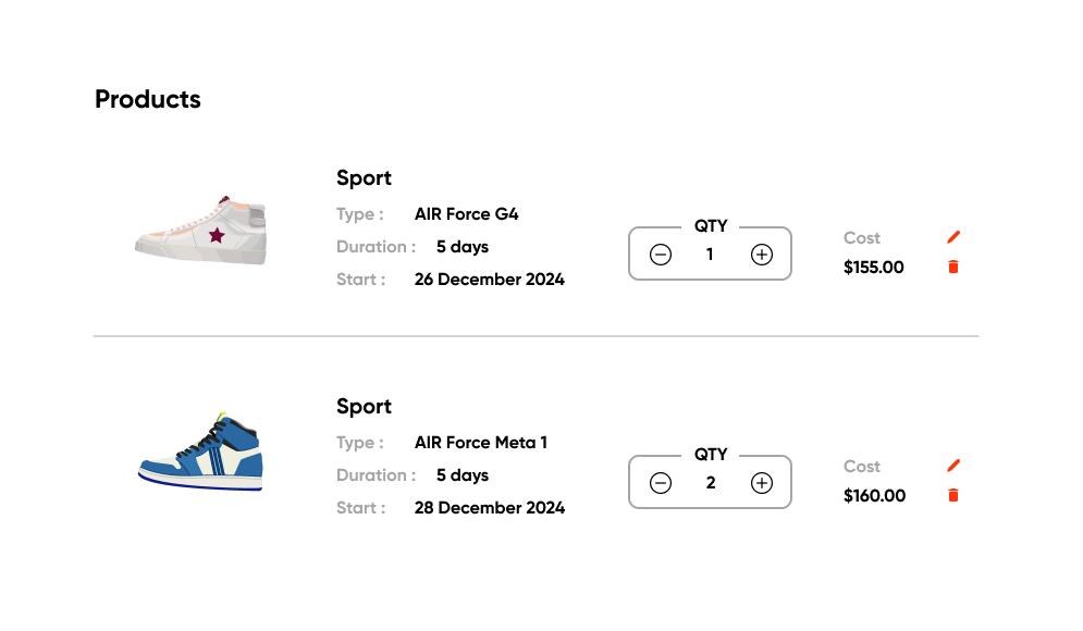
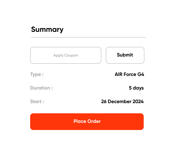
Cart summary
Summary with a ‘Proceed’ CTA
On the right side of the screen, a streamlined summary section offers users essential information about the total and unit costs of the selected products. This minimalistic presentation remains consistent across the entire checkout process, ensuring users are continuously provided with vital cost details to facilitate informed decision-making as they progress to the delivery and payment steps.
Furthermore, within this section, users have the option to conveniently redeem any promotional codes.
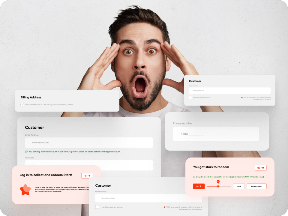
3. Delivery & Billing Information
User Information
The initial form presented to users features a mandatory email input field, playing a pivotal role in determining one of three distinct user journeys:
1Guest purchase
This essential feature, often overlooked in many ecommerce checkout processes, addresses potential user abandonment.
To streamline this, we propose a straightforward checkbox option, allowing users to create an account seamlessly while providing delivery information. Additionally, we include brief text notifications highlighting the added benefits, such as promotional points, available to registered users.
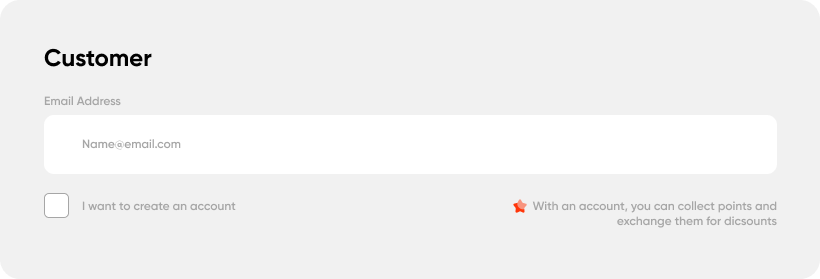
By default the user can finish the checkout process as a guest user. Signing up or creating an account is not required
2Creating account in checkout
For users who opt to create an account during the checkout process without going through the traditional ‘sign-up’ route, a simple checkbox and two password input fields offer an uncomplicated account creating option.
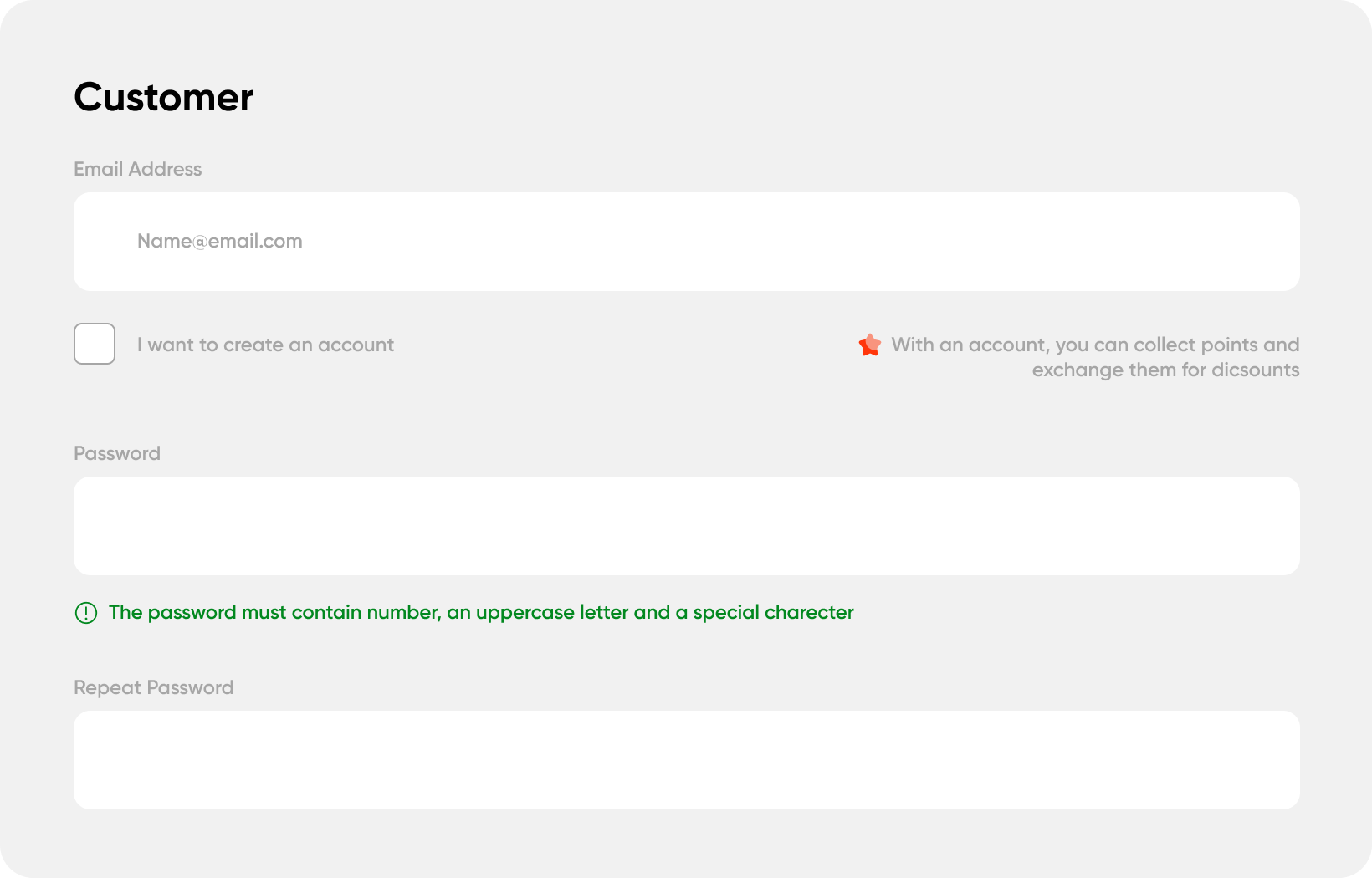
Checking the “I want to create an account” option expands the card. The user is required to provide a password
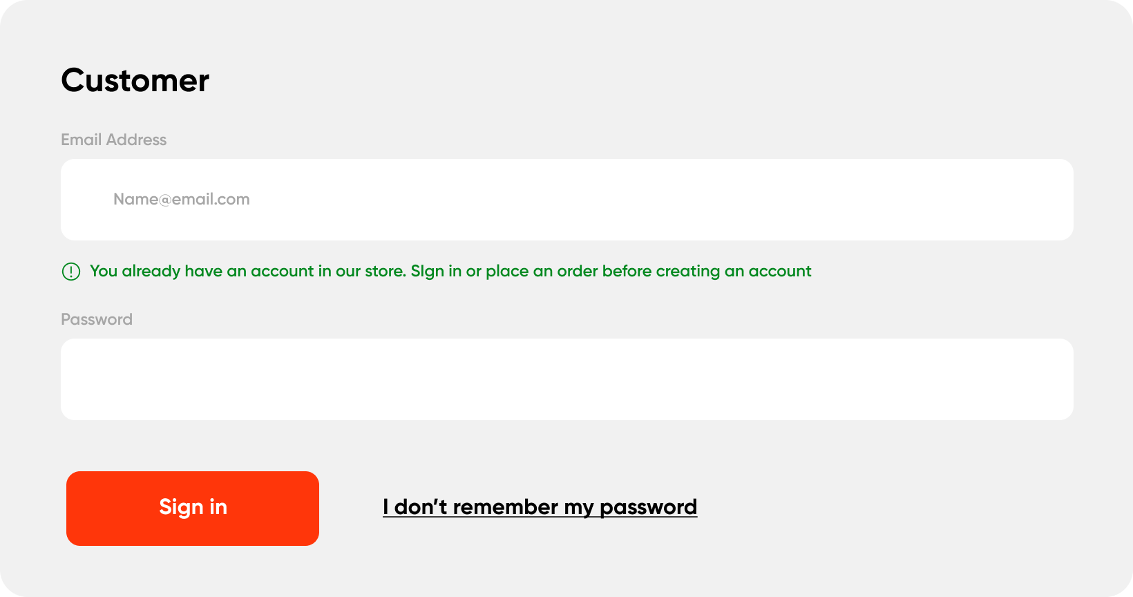
If the provided email address is connected to an existing account - we provide the users with a possibility to directly sign in and continue the checkout process.
3Checking for existing accounts
Designed for users who have previously created an account but haven’t logged in before proceeding with the checkout, our system automatically verifies their registration status using the provided email address. If an account is identified, we offer users the convenience of instant sign-in.
This approach ensures a seamless and efficient user experience tailored to various preferences and scenarios.
Delivery method
While StoreME does not use third-party delivery services for the users to choose from, we offer users detailed insights into the advantages of this delivery method, notably employing freezer trucks, along with transparently presenting associated costs. This approach fosters trust with clients by providing comprehensive information about our service.
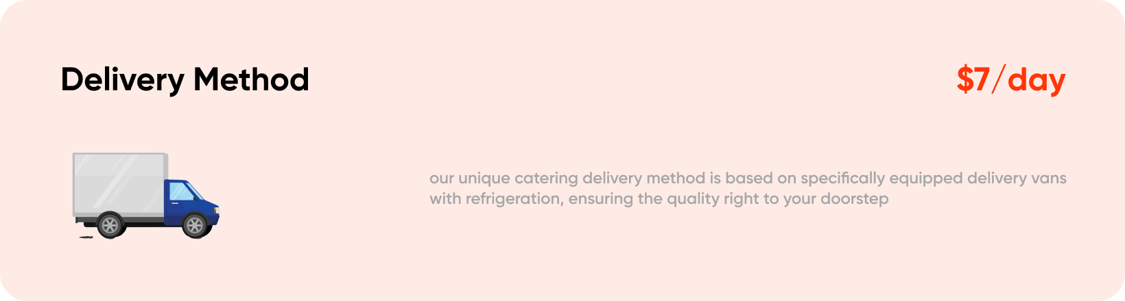
Delivery method section
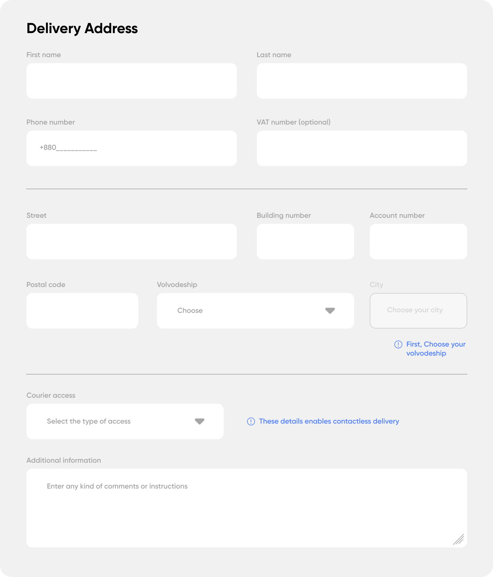
Delivery Information
StoreME’s products, often delivered daily by in-house couriers, necessitate users to furnish additional details for a seamless delivery experience, such as gate codes and specific delivery instructions. Recognizing the complexity of the address forms, we prioritize a user- centric design approach to enhance usability and streamline the input process.
1Input organization
To simplify the user experience, inputs are strategically organized into three sections: User Identification and Contact Information, Delivery Address, and Additional Information for the Courier. Clear dividers subtly communicate the segmentation, ensuring ease of comprehension.
Checking the “i want to create an account” option expands the card. The user is required to provide a password.
2Input design
The design features straightforward inputs with slightly emphasized fields and labels positioned above. Tailored inputs incorporate helpful elements, such as dashes for required numerical input or placeholders offering hints for necessary
actions. Additionally, helper text is provided when needed, and optional inputs are explicitly labeled as such.

Examples of a phone number input
3Billing address
To expedite the process for users with matching delivery and billing address, a preselected checkbox is provided. This will be used by most users and we won’t require them to input the same information twice into different forms. For those requiring separate billing details, unchecking the box seamlessly expands the section into a new address form.